A Simple Website Audit Checklist for Non-Technical Owners
A practical, non-technical website audit checklist for small business owners and creators. Learn how to quickly spot issues with clarity, trust, mobile usability, navigation, contact details, and calls to action.
If you own a small business, creator brand, or service website, you do not need to be technical to spot many of the problems that hurt conversions. A simple website audit can reveal whether your homepage is clear, your contact details are easy to find, your pages work on mobile, and whether visitors have a reason to trust you. The goal is not perfection. The goal is to make sure your site is doing its job: helping the right people understand what you offer and making it easy to take action.
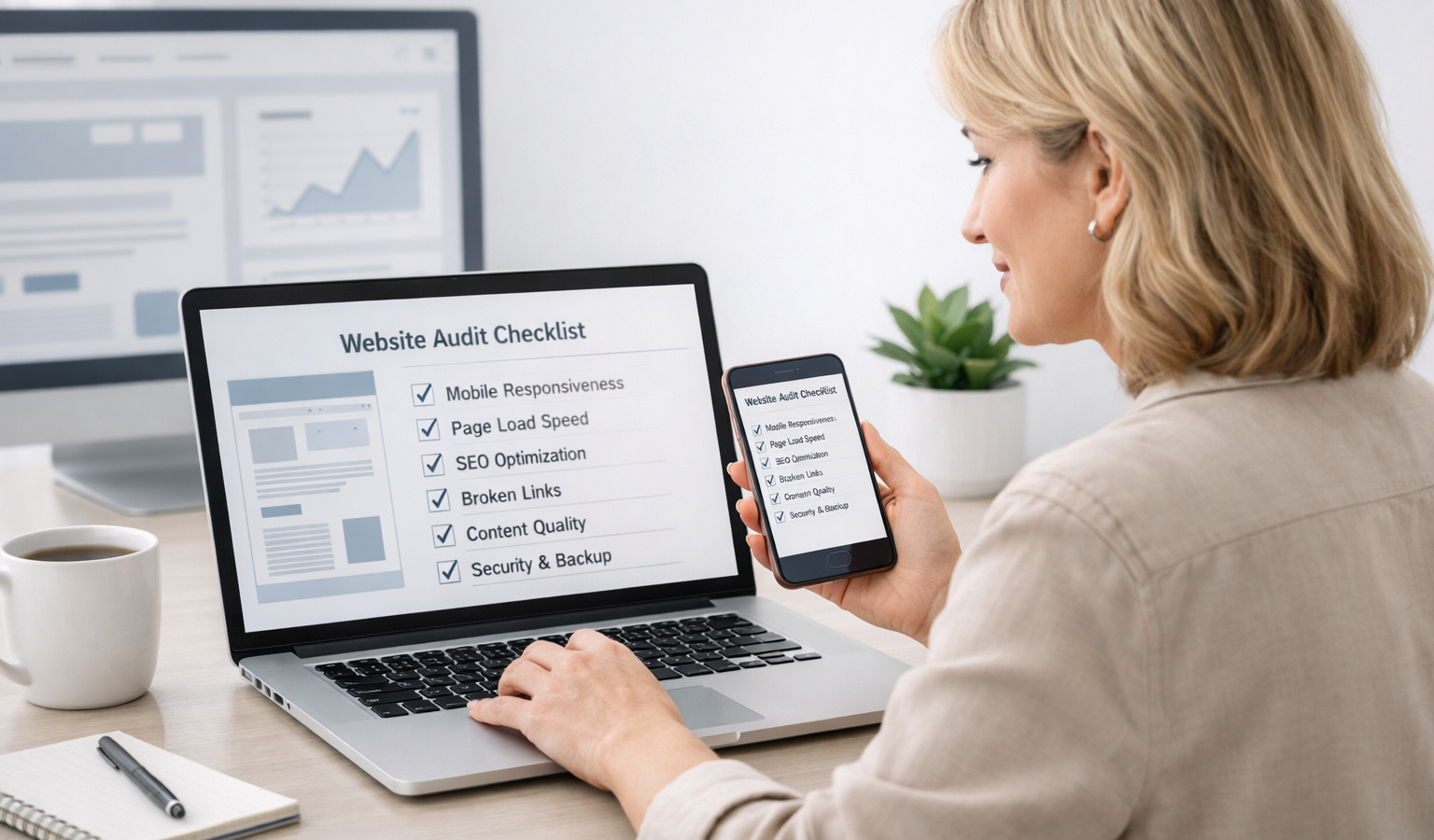
Below is a practical website audit checklist you can work through in under an hour. You can do most of it with nothing more than your browser and a phone. If you manage your own site, or you work with someone who handles website hosting and development for you, this checklist will also help you have a more informed conversation about what needs to be improved.
A Simple Website Audit Checklist for Non-Technical Owners
1. Check whether your homepage says what you do in the first 5 seconds
Your homepage should answer three questions almost immediately:
- What do you do?
- Who is it for?
- What should I do next?
If a visitor has to scroll, guess, or read a wall of text to understand your business, the page is working harder than it should. For a small business, clarity usually beats cleverness.
Read the top of your homepage out loud. If it sounds vague, overly creative, or crowded with buzzwords, simplify it. A strong headline might be as direct as: “Reliable bookkeeping for growing service businesses” or “Custom cakes for weddings, birthdays, and events.”
Then look for a supporting sentence or two that explains the benefit. This is a good place to be transparent about what you offer, who you help, and what makes your approach different.
2. Test your site on a phone, not just a desktop
Many business owners review their site on a laptop and assume everything is fine. In reality, most visitors will probably see your site on a phone first. That makes mobile friendliness one of the most important checks you can do.
Open your site on your phone and ask yourself:
- Can I read the text without zooming in?
- Are buttons large enough to tap easily?
- Do images fit the screen properly?
- Do menus open and close without frustration?
- Can I contact the business without hunting around?
Pay attention to anything that feels cramped, hard to tap, or visually confusing. If you have to pinch and zoom or repeatedly scroll sideways, that is a strong sign the page needs cleanup. Good mobile design is not just a nice feature; it is part of a reliable customer experience.
3. Make your contact information obvious
If someone wants to reach you, they should not have to search for the answer. Your phone number, email address, service area, and contact form should be easy to find from any important page.
Here is what to check:
- Your contact page is linked in the main navigation.
- Your phone number and email appear in the footer or header.
- Your address is present if you serve local customers in person.
- Your contact form works and sends messages to the right inbox.
If you rely on appointments, bookings, or quotes, make that process obvious too. A visitor should know whether they should call, email, schedule a meeting, or fill out a form.
Clear contact information builds trust. It also makes your business feel real, responsive, and professional.
4. Review your navigation like a first-time visitor
Navigation is the roadmap for your site. If it is too crowded or too vague, visitors may leave before they find what they need.
A good rule for most small business sites is to keep the main menu short and predictable. Common items include:
- Home
- About
- Services
- Portfolio or Work
- Blog or Resources
- Contact
Ask yourself whether every menu item is genuinely useful. If you have too many pages in the main menu, simplify. If your labels are creative but unclear, make them more obvious. “Solutions” may sound polished, but “Services” is often easier for users to understand quickly.
Also check whether the path to important pages feels logical. A visitor should not have to click through several layers to find pricing, booking, or contact details.
5. Look for slow-loading pages and obvious speed problems
You do not need to understand code to notice when a site feels sluggish. Open your homepage and a few key pages. If images appear slowly, buttons lag, or the page shifts around while loading, your site may need attention.
Common causes include oversized images, too many scripts, heavy page builders, or weak website hosting. You do not need to diagnose the technical cause yourself, but you can identify the symptom and flag it for improvement.
What to look for:
- Do large banner images take a long time to appear?
- Does the page look unfinished before fully loading?
- Do videos or animations slow things down?
- Is the site noticeably slower on mobile data than on Wi-Fi?
Speed matters because people are impatient, especially on mobile. A site that feels responsive also feels more reliable. If your pages are consistently slow, ask your host or developer whether your current website hosting is appropriate for your traffic and content.
6. Click every important link and button
Broken links are frustrating and can quietly damage confidence. You do not need a tool to catch many of them. Just click through the links and buttons that matter most:
- Main navigation links
- Service or product buttons
- Contact links
- Footer links
- Social media buttons
- Download links, if you offer resources
If something leads to a 404 page, a dead end, or the wrong destination, fix it right away. Even one broken link can make a site feel neglected. That matters more than many business owners realize.
Also check that buttons do what they promise. If a button says “Book a Call,” it should not send people to a generic homepage. If a link says “View Pricing,” it should not open an unrelated page.
7. Look for trust signals that make your business feel credible
When people decide whether to contact you, they are often asking a simple question: Can I trust this business?
Strong trust signals help answer that question. Depending on your business, they might include:
- Testimonials or reviews
- Client logos or featured work
- Clear pricing or starting prices
- Professional photos of you or your team
- An About page that sounds human and specific
- Visible policies for refunds, shipping, or service terms
Transparency matters here. If you sell services, be clear about what is included. If you work with clients, explain your process. If you sell products, make shipping and returns easy to understand. A trustworthy site does not hide the details.
Even small touches help, such as a real business email, a consistent brand voice, and a footer that shows your location or company name. These details support the feeling that your business is established and dependable.
8. Make your calls to action easy to spot
Every important page should guide the visitor toward a next step. That next step might be booking a call, requesting a quote, joining a newsletter, buying a product, or learning more about your services.
Good calls to action are simple and direct. Examples include:
- Request a Quote
- Book a Discovery Call
- View Services
- Shop Now
- Contact Us
When reviewing your site, ask:
- Is the main call to action obvious on the homepage?
- Do service pages have a clear next step?
- Do buttons use action-oriented wording?
- Is there more than one path to contact or convert?
A website should never leave people wondering what to do next. If your visitor is interested, your site should make it easy to move forward.
9. Check for spelling, outdated information, and old content
Small mistakes can create a bigger impression than you think. Outdated hours, old promotions, broken announcements, and misspellings can make a website feel neglected.
Do a quick sweep for:
- Outdated dates or event information
- Old prices or expired offers
- Broken images
- Spelling and grammar mistakes
- Old staff names, links, or references
If you see outdated material, either remove it or update it. A website does not need to be fancy to feel professional, but it should feel maintained.
Simple website audit checklist you can reuse
Here is a condensed version you can revisit every few months:
- Read the homepage and confirm it clearly explains what you do.
- Open the site on your phone and check readability, buttons, and menus.
- Make sure contact details are visible on every key page.
- Review navigation for simplicity and clarity.
- Notice whether pages load quickly and feel responsive.
- Click important links and buttons to check for broken paths.
- Look for trust signals such as testimonials, policies, and real business details.
- Verify that calls to action are clear and easy to follow.
- Fix spelling, outdated offers, and old content.
Reminder: You do not need to be a developer to improve your website. In many cases, the biggest gains come from clearer messaging, simpler navigation, and better visibility into the basics.
Key takeaways
- A website audit for non-technical owners is mostly about clarity, usability, and trust.
- Your homepage should explain what you do quickly and confidently.
- Mobile friendliness, easy contact access, and simple navigation matter more than design trends.
- Speed, broken links, and outdated content can quietly hurt conversions.
- Transparent information, trust signals, and strong calls to action help visitors feel ready to buy or reach out.
Used regularly, this kind of audit helps a small business website stay useful instead of drifting into confusion. You do not need a large redesign to make meaningful improvements. Often, a few focused edits are enough to make your site feel more reliable, more transparent, and easier to use.
Related Resources
- Google PageSpeed Insights — A free tool from Google that helps you check whether your pages feel slow and identifies common performance issues.
- W3C Web Content Accessibility Guidelines (WCAG) — The official accessibility standard that can help you make your site easier to use for more visitors.
- web.dev Accessibility Learning Resources — A practical, beginner-friendly guide to making websites more usable and inclusive.
- Google Business Profile Help: Edit your business information — Useful if you want to keep your business name, address, phone number, and other contact details consistent online.
- FTC Guidance on Online Reviews and Endorsements — Helpful for understanding how to present testimonials and reviews in a way that is transparent and trustworthy.